aaacrhsc
The Alabama African-American Civil Rights Heritage Sites Consortium presented us with the opportunity to conceive a meaningful brand identity for them. We knew we wanted to create something special—something that would grow and evolve, communicate and influence, make friends (and fans), and take on a life of its own. Our endeavor began with a lot of listening to fully grasp the nuances of the Consortium’s situation and goals.

The brandscape
Rooted in History, Looking Forward
We dove head-first into the research phase, gathering inspiration from African and African-American culture, history, textiles, and Adinkra symbolism. And we used our years of experience in the nonprofit space to inform some pretty prolific white boarding sessions. It all led us to a visual aesthetic that is truly authentic and connection building. While the consortium will always pay tribute to the heroes and monuments of the past, this concept is focused on what comes next: engaging and inspiring new generations to help spur progress and redefine our future.

Our stationery suite
Abracadabra!
Our first challenge was creating a logo from eight un-abbreviate-able words. We needed to come up with something that read quickly and coherently—something that made the AAACRHSC’s lengthy name more digestible. How’d we do it? Design magic, that’s how. This contemporary, badge-style logo, with its balanced composition, is the perfect design solution.
Color Palette & Visual Elements
The AAACRHSC’s colors are rooted in the African tradition: proud and exuberant, but also terrestrial and substantive, emulating the earth and the sky. The texture we used as a visual branding element calls to mind the patterns of vintage mud cloth textiles. Together with the gradient color blocking, they add interest and depth and cultural relevance.
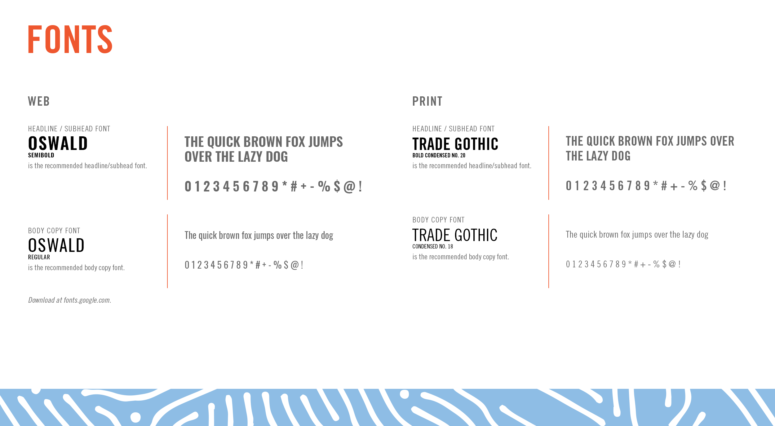
Brand Fonts
A condensed typeface was essential for legibility and economy of space in the logo. Trade Gothic’s character and sturdiness lend gravitas without coming off as too corporate.


Billboard design

Banner stand design
Bring on the tourists
From there, we compiled stories, info, and photographs from each of the 20 heritage sites to write and design the brochure. It provides contact info and hours, but more importantly, it helps give these significant places historical and geographical context. It’s the ultimate guide for tourists and civil rights activists alike. From the brochure, we pulled out individual sites to feature on each rack card and translated the rack cards into full-size banner stands for the sites’ lobbies and traveling exhibitions.